Portfolio Case Study
Motorsport / Event Assets
Sl Motorsport
Branding for SL Motorsport racing team. Aggressive logo, racing visual identity, and marketing materials for professional motorsport team.
The Challenge
This one's personal. As a car enthusiast, working on SourceLess Motorsport was a dream project.
SourceLess is a tech company on a mission to change the digital world for the better. SourceLess Motorsport is their racing division, and they needed a clear identity that would stand out in the crowd at events.
The goal was simple: create branding that makes them instantly recognizable. Team t-shirts, printable event assets, banners—everything needed to scream “we're here” from across the paddock.
The Approach
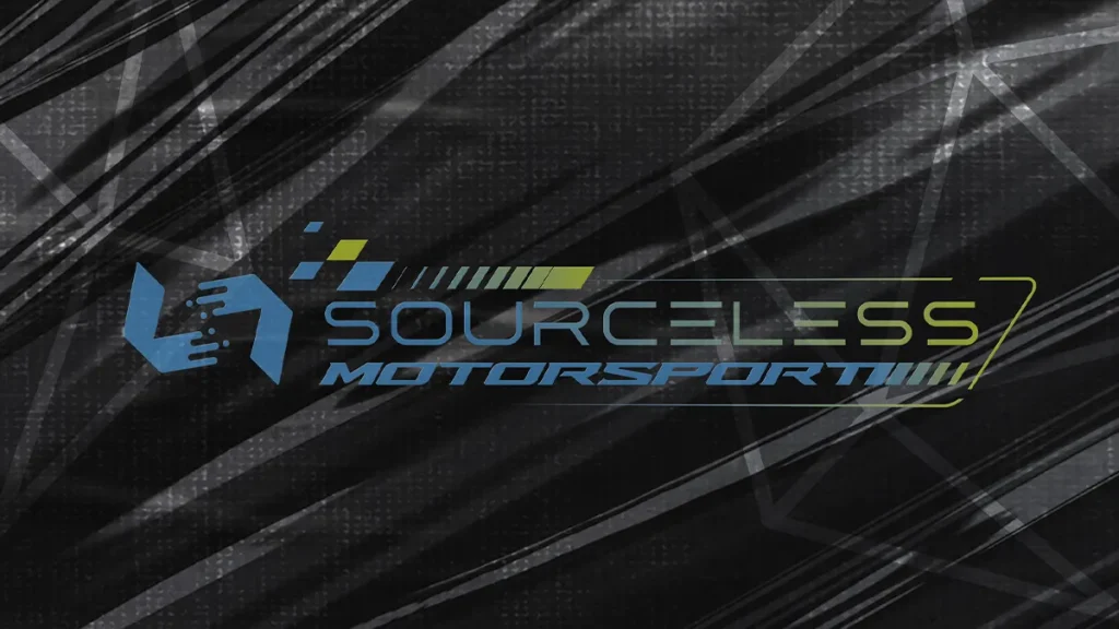
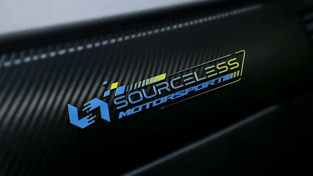
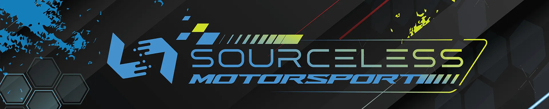
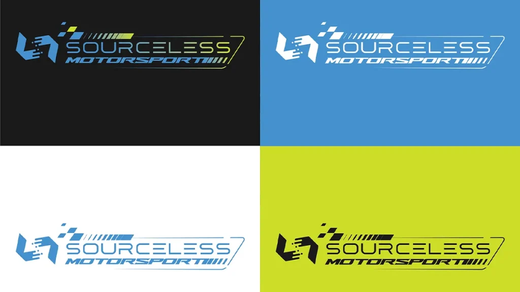
I started with the logo. A dynamic, futuristic emblem featuring a stylized “SL” icon that looks like a pixelated or blocky hand—a nod to the parent tech company. The typography for “SOURCELESS MOTORSPORT” is wide, slanted, and bold, with a checkered flag motif integrated into the letter “M” and speed lines trailing the text. The color palette is high-contrast and energetic: black, white, lime green, and cyan/blue,
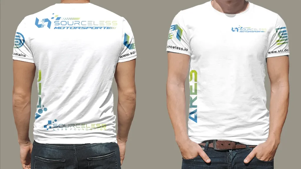
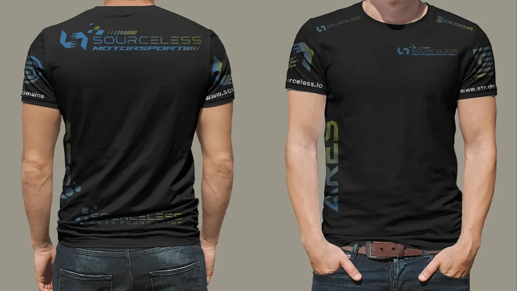
For the team apparel, I designed professional-grade t-shirts in black and white versions. The primary logo sits on the chest and back, with extensive sponsorship-style branding on the sleeves and sides (ARES, SourceLess.io, STR DOMAINS).
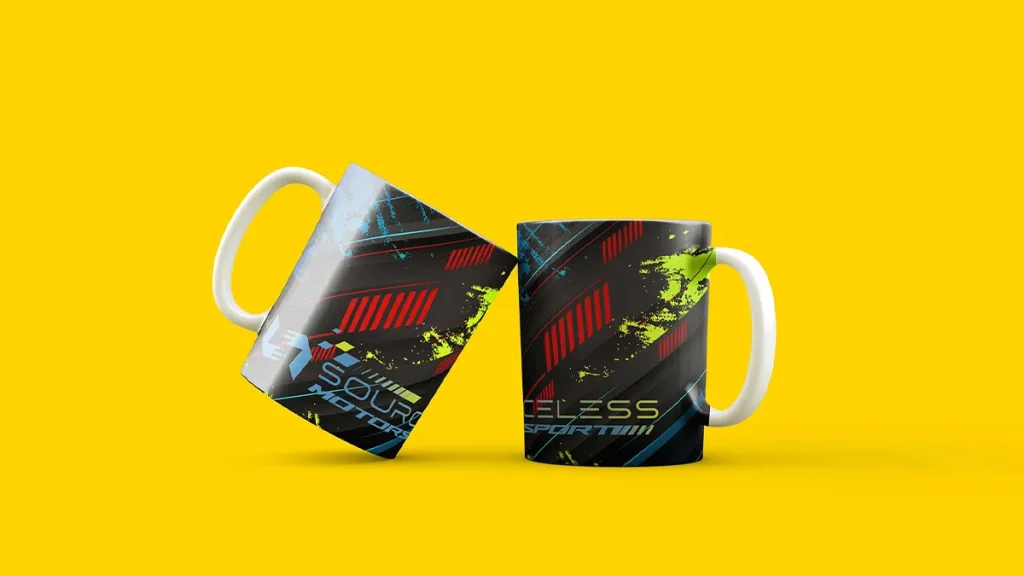
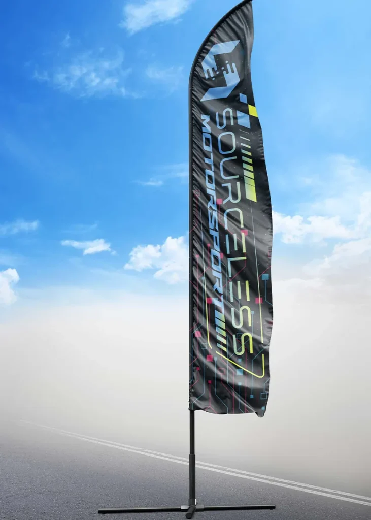
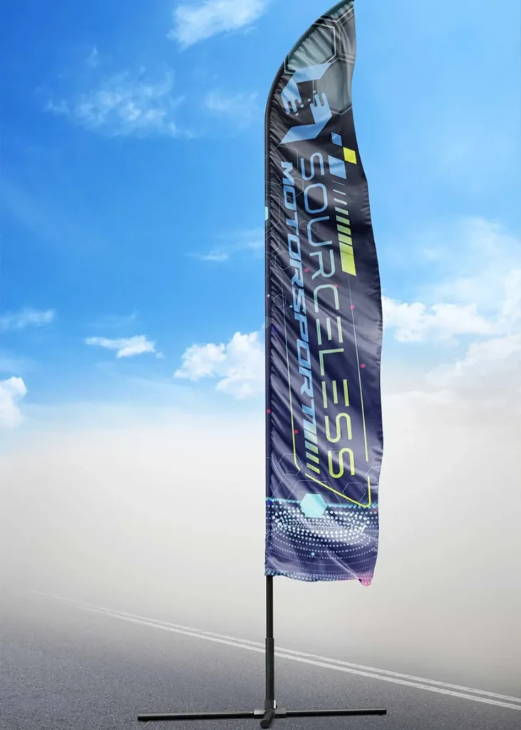
Then came the event assets: feather flags for high visibility at outdoor events, event signage with wide-format layouts that emphasize the speed lines of the logo, and branded mugs with digital noise backgrounds and neon streaks.
The Impact
SourceLess Motorsport now has a brand identity that doesn't blend in. The cyber-racing aesthetic sets them apart from traditional motorsport teams, and the high-contrast colors make them impossible to miss at events.
Media
Project Visuals
Final project visuals across the brand identity, digital assets, and campaign materials.