Portfolio Case Study
Logo / Identity
Infinity Play
Visual identity and future app design for Infinity Play, adult store. Modern, discreet branding with plans for mobile app development.
The Challenge
Infinity Play is launching as an online adult shop and app. They needed a logo fast—not because they were ready to launch, but because they needed to paint the bigger picture before diving into app development.
This is the kind of project where the logo has to do a lot of heavy lifting. It needs to feel premium, not sleazy. Sophisticated, not generic. And it has to work across everything from a mobile app icon to neon signage.
We're still in the planning stages for the app, but the brand identity had to come first.
The Approach
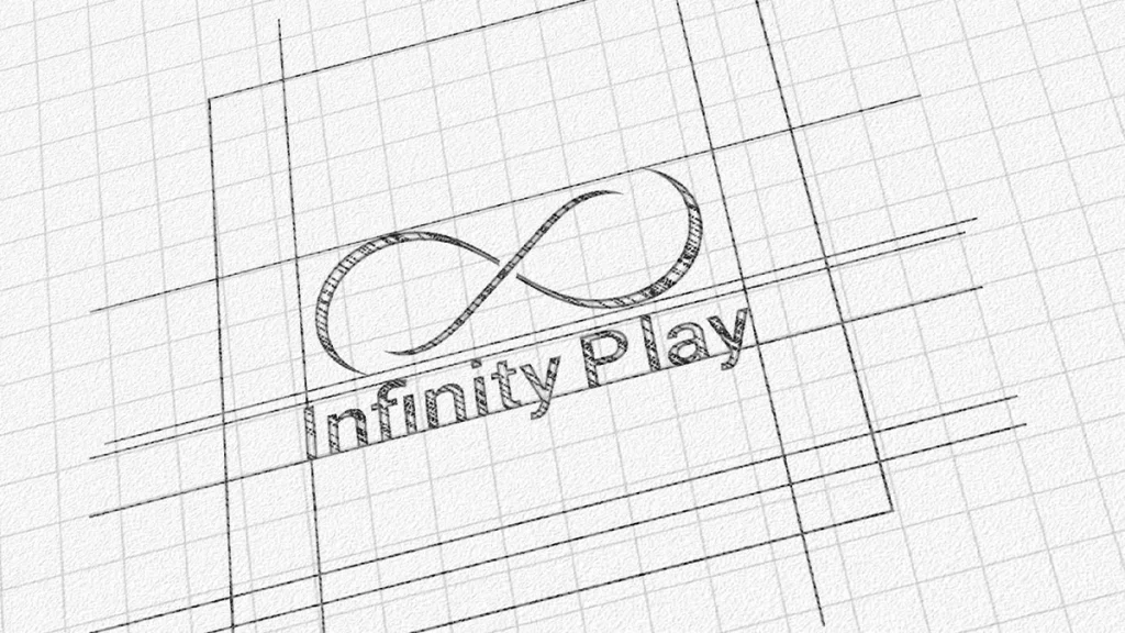
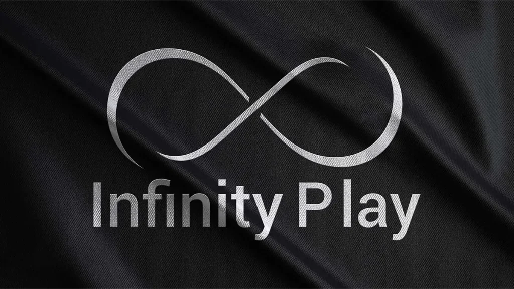
I started with the infinity symbol—because the name practically demanded it. But I didn't want the typical closed-loop infinity. I gave it breaks, tapered ends, a ribbon-like flow. It feels fluid, continuous, but also elegant and modern.
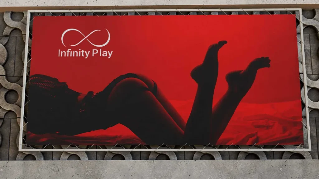
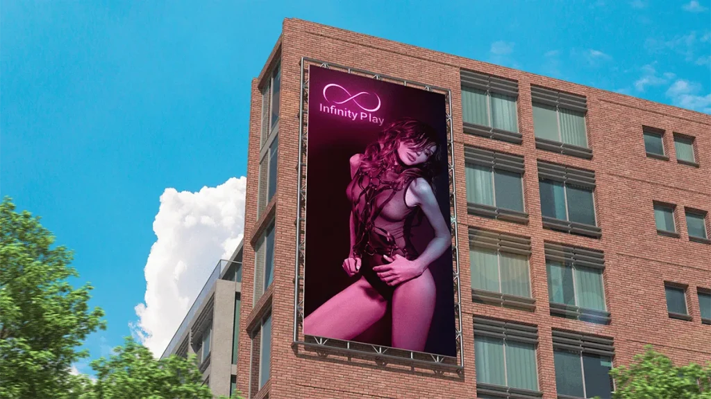
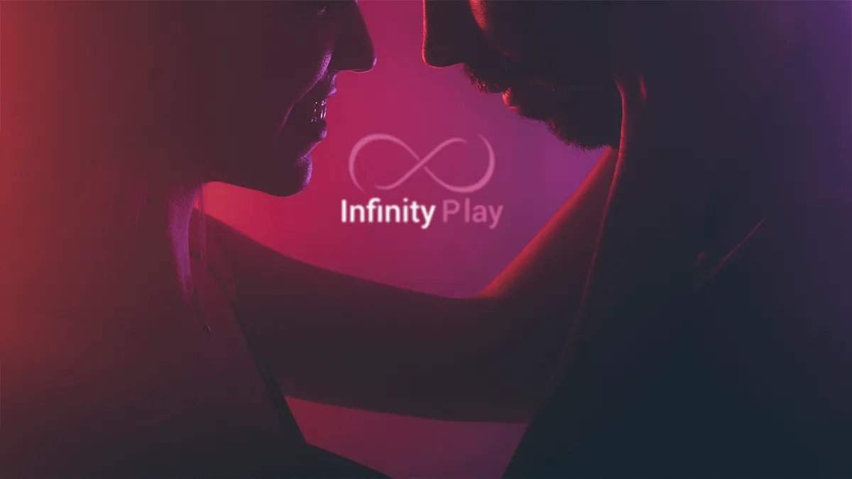
The color palette was critical. Deep reds, vibrant neon pinks, and matte blacks. This isn't a “fun” brand—it's a lifestyle brand. The colors needed to feel sensual and high-end, like something you'd see in a premium fashion campaign, not a typical adult shop.
For the typography, I kept it clean and contemporary. “Infinity” is slightly bolder than “Play” to create visual hierarchy. The logo needed to be versatile—silk backgrounds, neon treatments, technical sketches—it all had to work.
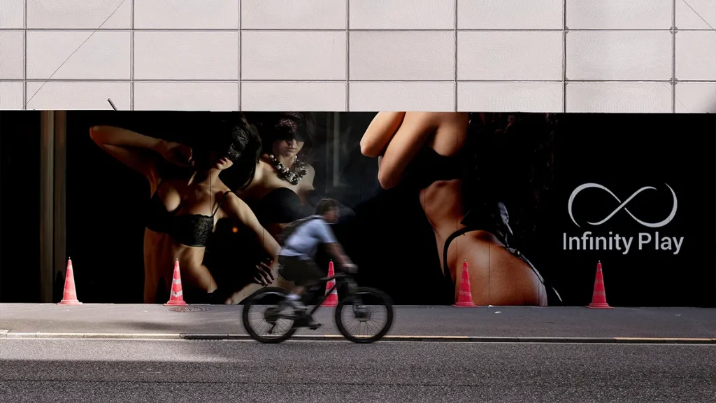
Every mockup was designed to show how the brand scales—from a small app icon to a massive billboard. The identity needed to feel just as premium on a phone screen as it does on a city wall.
The Impact
The logo gave Infinity Play the visual foundation they needed to move forward with app development.
Media
Project Visuals
Final project visuals across the brand identity, digital assets, and campaign materials.